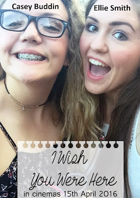
 Today I developed my Photoshop skills as I have never used this program before. I learnt how to add layers and pictures. I have used a picture of Casey and I, who are the main characters however for my real poster I will use a still from the film or have a photo shoot. I also found a picture of a notebook page and added that at the bottom where my title would go. This would link to my film as the plot revolves around a list/notebook, I used a fade option on this to integrate the picture into the poster.
I also learnt how to add text to the picture. I put the actors names on the heads of the actors, which I think may be a good idea to use in my real poster. I used the font that I got off the dafont.com website called, End of the Dream. I haven't definitely decided on this font but this looks really good. I also added the date however I need to look more into the placing of these details on real film posters.
As a first time using photoshop I think I did quite well and I have decided I will use this program when I am creating my real film poster and I can't wait to get better at it!
No comments:
Post a Comment